You put a QR code on the counter. People scan it. The Google Form opens. And then... nothing.
- The QR Code May Be Working Perfectly
- Count the Questions From the User's Perspective
- The First Screen Has a Bigger Job Than You Think
- Don't Hide the Reason Behind the Form
- Your CTA Might Be Asking for the Wrong Action
- Mobile Is the Real Testing Environment
- The Person Scanning May Be in a Hurry
- Use the QR Code as the Beginning of the Funnel
- Build the QR Experience Around One Clear Action
- How to Create the QR Entry Point
- Run a Five-Minute Friction Test
- What to Watch After Launch
- The Best QR Code May Be the One You Stop Blaming
No response. No completed survey. No registration. No feedback.
It is easy to assume the QR code is the problem, especially when the campaign looks successful at first glance. But a scan only tells you that someone was interested enough to open the link. It does not tell you that the person was willing to spend another two, five, or ten minutes completing whatever comes next.
That distinction is where many QR-based forms lose momentum.
The real journey looks more like this:
See → Scan → Open → Understand → Start → Complete → Submit
Your QR code controls only part of that journey. If people disappear after opening the form, the bigger issue may be the experience waiting for them on the other side.
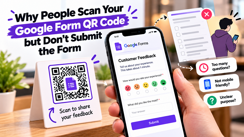
The QR Code May Be Working Perfectly
Let's start with the obvious possibility: your QR code may not be broken at all.
If the camera recognizes it, the correct Google Form opens, and the page loads normally, then the basic access problem has already been solved. Replacing the code with another one may not change the number of completed responses.
Imagine a restaurant asking customers for feedback. A customer scans the code after paying, sees a form containing twelve required questions, and closes it.
The QR code worked.
The customer simply decided that answering twelve questions was not worth the effort.
That is why looking only at scans can create a misleading picture. A high number of scans combined with a low completion rate is telling you something useful: people are willing to enter the experience, but something is stopping them from finishing it.
Count the Questions From the User's Perspective
The person who creates a form knows why every question exists. The person filling it out does not necessarily care.
This creates a common trap. One question seems harmless. Then another is added. Then another. Before long, a simple feedback request has turned into a mini-interview.
Ask yourself what information you genuinely need.
If a customer is giving feedback about a purchase, do you really need their name, phone number, email address, age, location, purchase date, favorite product category, satisfaction score, written comments, and three follow-up questions?
Maybe you do. But if you don't, every unnecessary field creates another reason to stop.
A shorter form is not automatically a better form, but every question should earn its place.
The First Screen Has a Bigger Job Than You Think
When someone opens a form from a QR code, they have very little context.
They may not remember why they scanned it. They may be standing in a busy store. They may be waiting for an order. They may be holding a shopping bag with one hand and their phone with the other.
The first screen needs to quickly answer three things:
What is this?
Why should I complete it?
How long will it take?
A short introduction can do more work than a wall of instructions.
For example, “Tell us how your visit went — this takes about 60 seconds” gives the visitor a much clearer expectation than a generic heading such as “Customer Survey.”
The difference is tiny from a design perspective, but meaningful from a user perspective.
Don't Hide the Reason Behind the Form
People are more willing to complete an action when they understand what their response is being used for.
A feedback form could explain that responses help improve future service. A registration form can tell people what happens after they submit. An event check-in form can make it clear that completion confirms their attendance.
This is especially important when the QR code appears on printed material without someone nearby to explain it.
The physical CTA and the opening screen should tell the same story.
If a poster says “Scan to enter,” the form should not greet the user with a completely different purpose. If a table card says “Share your feedback,” the first screen should make it immediately obvious that the visitor has reached the feedback form.
Consistency reduces hesitation.
Your CTA Might Be Asking for the Wrong Action
“Scan QR Code” is an instruction, but it is not much of a reason.
Compare it with:
Scan to leave your feedback
Scan to check in
Scan to register
Scan to tell us what you think
Scan to get started
The better version depends on the task, but the principle is simple: describe the outcome rather than the technology.
Most people do not care that they are scanning a QR code. They care about what happens afterward.
This is one of the easiest improvements to make because it does not require redesigning the form itself. Sometimes changing the few words beside the code is enough to make the purpose much clearer.
Mobile Is the Real Testing Environment
A Google Form accessed through a QR code is almost certainly being opened on a phone.
That means desktop-first thinking can get you into trouble.
Long questions that look reasonable on a large monitor can feel exhausting on a narrow screen. Large blocks of introductory text can push the actual form below the fold. Complicated answer choices can require excessive scrolling.
The test should therefore happen on the device your audience is actually using.
Scan the code with a phone. Complete the form with one hand if that reflects the real situation. Try it while standing. Pay attention to how much scrolling is required. Look at the amount of text before the first meaningful interaction.
You are not testing whether the form technically works.
You are testing whether it feels easy.
The Person Scanning May Be in a Hurry
Context changes how much effort people are willing to tolerate.
Someone sitting at home may happily spend five minutes answering a detailed questionnaire. Someone standing at a checkout counter probably will not.
This is why the same form can perform differently depending on where its QR code is displayed.
A short feedback form at a restaurant should respect the fact that customers may be preparing to leave. A registration form at an event needs to work when dozens of people are waiting behind each other. A classroom activity can assume a different level of attention because students are already participating in the session.
The environment sets an invisible time limit.
Design the form accordingly.
Use the QR Code as the Beginning of the Funnel
A QR code is often treated as the campaign itself. It isn't.
It is the entry point.
Once someone scans, the real conversion process begins. That means the physical design, CTA, form structure, questions, mobile experience, and submission step all need to work together.
A useful way to think about it is:
The printed material earns attention.
The QR code earns the visit.
The form earns the response.
If the first two stages are strong but the third one is painful, the campaign will still underperform.
This is why changing the QR code alone is rarely a magic fix for a weak form.
Build the QR Experience Around One Clear Action
Before generating the code, decide what you actually want the visitor to accomplish.
Is it a one-minute survey? A registration? A check-in? A product review? A contest entry? A request for information?
One form can technically contain several objectives, but combining too many of them can make the experience feel unfocused.
A person who scans a “Give Us Feedback” code should not suddenly discover that they are also being asked to subscribe to a newsletter, provide detailed demographic information, and answer a product research questionnaire.
One clear promise creates a much cleaner experience.
How to Create the QR Entry Point
Once the form itself is ready, copy its shareable URL and turn that link into a scannable code. If you are looking for a qr code generator for google forms, choose a straightforward workflow that lets you generate the code from the form URL and then test the result before putting it into production.
The important part is not simply generating the image.
Open the code from the actual printed design. Make sure the correct form appears. Submit a test response. Confirm that the response reaches the right destination. Then repeat the test from the distance and environment where real users will encounter it.
A code that works on your laptop is not enough evidence.
Run a Five-Minute Friction Test
Before printing hundreds of cards or putting a large sign in front of customers, go through the entire journey yourself.
First, look at the printed material without knowing anything about the campaign. Can you tell what the QR code is for?
Next, scan it. Does the form open immediately?
Read the introduction. Do you understand why you should complete it?
Start answering. Are the questions straightforward?
Continue until the end. Does the form feel longer than the promise suggested?
Finally, submit it. Does the confirmation make sense, and does the response appear where it should?
This simple exercise can uncover more problems than staring at the QR image itself.
What to Watch After Launch
Once the form is live, separate the stages of the journey whenever possible.
If people are not scanning, look at the physical placement, visibility, CTA, and perceived value.
If people scan but rarely start, examine the opening screen and the expectation created by the printed message.
If people start but abandon the form, look closely at question length, required fields, mobile usability, and overall effort.
If people finish but the quality of responses is poor, the issue may be the questions themselves rather than the QR experience.
Thinking in stages makes troubleshooting much easier because you stop treating every problem as a QR problem.
The Best QR Code May Be the One You Stop Blaming
There is something oddly satisfying about seeing a QR code scan successfully. It feels like a little technical victory.
But your real goal probably isn't to make a phone recognize a square pattern.
You want someone to register. You want useful feedback. You want a completed survey. You want an event check-in. You want an answer that helps your business make a better decision.
That means the important question is not:
“Can people scan this QR code?”
It is:
“What happens after they scan it?”
If the form is clear, focused, mobile-friendly, and respectful of the user's time, the QR code can become a wonderfully simple entry point. If the form is confusing or exhausting, even a flawless scan will not save it.
So before replacing your QR code because response numbers look disappointing, walk through the entire journey as a customer.
You may discover that the problem was never the code.
It was everything after it.