You've printed the QR code. You've tested it. Your phone scans it instantly, Facebook opens, and everything seems to work exactly as expected.
- A Working QR Code Can Still Be a Bad QR Code
- What Should Your Facebook QR Code Actually Open?
- Match the Destination to the User's Next Action
- How to Create a Facebook QR Code Without Making the Experience Complicated
- Seven Places Where the QR Should Be Easy to Scan
- Don't Put “Facebook” Above the QR and Call It a Day
- The 10-Second Test
- Don't Make People Guess What Happens Next
- Design for the Real World, Not the Mockup
- The Goal Isn't the Scan
- Think Beyond the Scan
Then nothing happens.
People walk past it. Customers see it. Visitors glance at it. Somehow, the number of scans remains disappointing.
At that point, it's tempting to blame the QR code. Maybe the design is wrong. Maybe people don't use QR codes anymore. Maybe the campaign simply isn't working.
But there's another possibility: the QR code works perfectly, while the reason to scan it doesn't.
That's an important distinction. A QR code is only the mechanism. Whether someone actually uses it depends on what you promise, where you place it, what happens after the scan, and how much effort the user expects to spend.
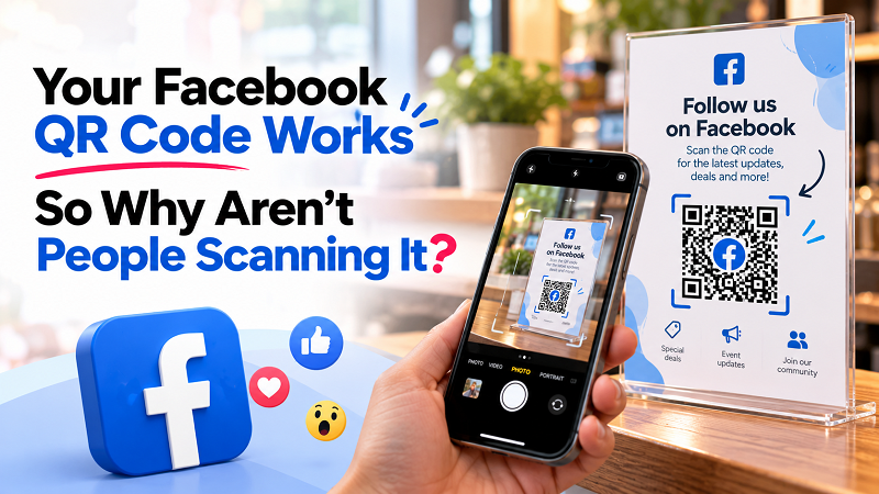
A Working QR Code Can Still Be a Bad QR Code
There's a strange assumption that if a QR code scans successfully, the job is done.
It isn't.
Imagine putting a perfectly functional QR code at the bottom of a crowded poster. It's surrounded by product photos, promotional text, phone numbers, social icons, and five different calls to action. Technically, the QR code works. Practically, nobody notices it.
Now imagine another QR code placed at eye level with a simple message: “See this week's deals on Facebook.”
Same basic technology. Completely different invitation.
This is why QR performance isn't just a technical question. It's also a communication problem.
People need to understand three things quickly: what they get, why they should care, and what they need to do.
If any of those answers is unclear, the QR can become nothing more than decoration.
What Should Your Facebook QR Code Actually Open?
Here's another question that's easy to overlook: where does the QR actually take people?
“Facebook” isn't a destination. It's a platform containing an enormous amount of content.
Your QR could lead to a Facebook Page, personal profile, Group, specific post, Event, or Messenger conversation. Each destination creates a different experience, so choosing one simply because it is the easiest URL to copy may not be the smartest approach.
If your goal is to build an audience around a brand, a Page may make sense. If you're inviting people into a community, a Group could be more relevant. If you're promoting a particular offer, sending visitors directly to the post containing that offer removes an extra step. If the objective is conversation, Messenger may be the more natural destination.
The right destination depends on what you want the person to do after scanning.
That's the part worth deciding before touching the QR generator.
Match the Destination to the User's Next Action
Think about the experience from the user's perspective rather than the brand's.
If someone is looking at a restaurant card and sees “Follow us on Facebook,” they probably expect to reach the restaurant's Page. If the QR instead opens an unrelated post from six months ago, the experience immediately feels strange.
Likewise, a promotion might work better when the QR takes visitors directly to the post explaining the offer. Someone interested in joining a community shouldn't have to land on a generic Page and then search for the Group.
A useful rule is to connect the physical message with the digital action as directly as possible:
- See the offer → view the offer
- Want to join → join the community
- Need help → start a conversation
- Want updates → follow the Page
The fewer unnecessary decisions you make the user take, the cleaner the experience becomes.
How to Create a Facebook QR Code Without Making the Experience Complicated
The technical process is simple. Start by copying the Facebook URL that matches the action you want people to take, then use a create facebook qr code tool to turn that URL into a scannable code. After generating it, scan the finished code yourself and confirm that it opens the intended destination on a mobile device.
But don't stop at “it works.”
Look at the complete journey. Does the destination still make sense when viewed by someone who has no context? Does the Facebook page or post clearly communicate what the visitor should do next? If the QR appears on printed material, does the surrounding message explain why scanning is worthwhile?
The QR generation itself may take seconds. The thinking around it is where the real value lies.
Seven Places Where the QR Should Be Easy to Scan
Placement can make or break a QR campaign. A code hidden in an awkward corner of a design isn't necessarily going to get attention simply because it's technically visible.
Think about places where people naturally pause or already have a reason to interact with your brand.
Checkout counters are useful because customers are already standing still and completing an interaction. A simple “Follow us for weekly offers” message can give them a reason to scan before they leave.
- Product packaging can turn a physical purchase into a continuing relationship, particularly when the Facebook destination provides updates, community content, or product information.
- Receipts and thank-you cards create another natural moment. The customer has already completed the purchase, so an invitation to stay connected doesn't feel completely out of context.
- Event registration desks can use QR codes to move attendees from an offline event into an online community or conversation.
- Printed promotions are effective when the QR takes people directly to the content being promoted rather than simply dumping them onto a generic Page.
- Store windows can work surprisingly well because potential customers may be looking at the business outside opening hours.
- And staff name cards can provide a simple digital bridge when customers need to continue a conversation after an in-person interaction.
The common thread is more important than the list itself: put the QR where the user's reason to scan already exists.
Don't Put “Facebook” Above the QR and Call It a Day
A logo tells people where they're going. It doesn't necessarily tell them why they should go there.
“Follow us on Facebook” is functional, but it's also generic. If you're competing for attention in a busy physical environment, giving someone a specific reason can be much more compelling.
Try thinking about the actual benefit instead.
“See this week's deals.”
“Join our local community.”
“Get new product updates.”
“Message us for support.”
“See today's menu.”
“Don't miss the next event.”
These messages are more useful because they describe the destination in terms of the user's interest rather than the platform itself.
The difference may look small on paper, but it's a completely different psychological invitation. You're not asking someone to scan a Facebook QR code simply because your brand has a Facebook presence. You're giving them a reason to take the next step.
The 10-Second Test
Here's a simple test that costs nothing.
Stand where your customer would normally stand. Look at the poster, card, package, counter display, or sign for about ten seconds. Don't read everything. Don't study the design. Just look at it naturally.
Can you find the QR code?
Do you know what will happen if you scan it?
Do you understand why you should scan it?
Does the destination sound useful?
Would you actually bother taking out your phone?
If the answer to the final question is no, don't immediately make the QR bigger. The problem may not be visibility.
Maybe the offer isn't interesting enough. Maybe the CTA is too vague. Maybe the destination isn't relevant. Maybe the QR is sitting in a location where people have no reason to stop.
That's why “more scans” isn't always a design problem. Sometimes it's an offer problem.
Don't Make People Guess What Happens Next
People are surprisingly cautious when interacting with unfamiliar QR codes.
That makes sense. A random square printed on a flyer doesn't tell them where it goes. Is it a website? A promotion? A social media profile? A registration form?
You don't have to write a paragraph explaining it. A short, specific CTA is usually enough.
Instead of:
SCAN HERE
try:
See our latest offers
Instead of:
FOLLOW US
try:
Get weekly updates on Facebook
Instead of:
LEARN MORE
try:
See the full event details
The QR code should answer the technical question — “How do I get there?” — while the CTA answers the more important question — “Why would I want to?”
Design for the Real World, Not the Mockup
A QR code may look perfect on your computer screen and behave very differently once it becomes a printed object.
A poster might be viewed from several feet away. A business card might be held in one hand. A window sticker might receive direct sunlight. A small receipt might be printed with less clarity than expected.
That's why real-world testing matters.
Keep enough contrast between the code and its background. Give the code some breathing room. Avoid placing it over complicated photographs or patterns. Make it large enough for the intended scanning distance, especially when people won't be standing directly in front of it.
And don't get too creative with the part that actually needs to remain recognizable.
A QR code doesn't need to look futuristic.
It needs to scan.
The Goal Isn't the Scan
This is probably the most important idea in the entire article.
A scan is not the final objective.
If someone scans your QR and immediately leaves the Facebook page, the campaign hasn't necessarily accomplished much. If someone reaches a post that doesn't answer their question, the scan itself becomes a meaningless metric.
The real objective might be a follow, a message, a Group join, a purchase, an event registration, or simply discovering useful information.
So don't build the campaign around the QR code.
Build it around the action that comes after the QR code.
The code is simply the bridge.
Think Beyond the Scan
A successful Facebook QR experience doesn't feel like a clever piece of technology. It feels almost invisible.
Someone sees something relevant. They understand what they'll get. They scan. The right Facebook destination opens. They take the next action.
No hunting. No guessing. No unnecessary detours.
That's the sweet spot.
So if your Facebook QR code works but isn't getting the attention you expected, don't automatically generate another one. Step back and look at the entire journey. Is the destination right? Is the CTA specific? Is the QR visible? Is the placement natural? Is there a compelling reason to scan?
Because the best QR code isn't necessarily the one with the fanciest design or the biggest size.
It's the one that appears exactly when someone has a reason to use it — and makes the next step ridiculously easy.