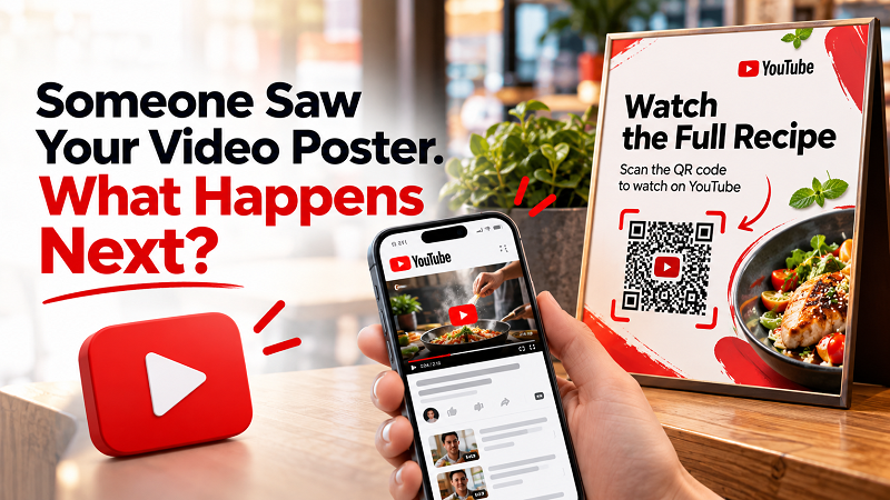
Imagine this: someone walks past your poster, notices the product, and sees that you have a video explaining how it works. They’re interested, so they pull out their phone, open YouTube, and try to find it. Then comes the awkward part. What was the name of the channel again? Was the video called “How It Works,” “Product Demo,” or “Complete Guide”? Maybe there are three videos with almost identical thumbnails. Five seconds later, the person has lost interest.
- The Problem With Asking People to Search Your YouTube Channel
- One Poster Can Lead to Five Completely Different Experiences
- Choose the Right YouTube Destination Before Creating Anything
- From YouTube URL to a QR People Actually Want to Scan
- The QR Is Not the CTA
- Where YouTube QR Codes Work Better Than You'd Expect
- Don't Make the Video Do Too Much
- Test It Like a Stranger, Not Like the Person Who Created It
- Don't Hide the QR in the Design
- Give the Scan a Reason to Happen
This is one of those small marketing problems that rarely gets discussed because technically, everything worked. The poster was there. The video was there. YouTube was there. The missing piece was the path connecting the three. If someone is already curious about your content, making them search for it manually can turn a moment of interest into a missed opportunity.
The Problem With Asking People to Search Your YouTube Channel
“Find us on YouTube” sounds easy. It isn't always. YouTube is built around discovery, which is great when you're browsing for something, but less convenient when you already know exactly what you want and simply need to get there.
Imagine a customer standing in front of a product display. You want them to watch a 90-second demonstration. If your instruction says, “Search for our channel on YouTube,” you've just handed them a task. They have to remember your channel name, type it correctly, identify the right account, open the channel, and find the relevant video. Every extra step creates another opportunity for the interaction to end.
The person may still genuinely want to watch the video. They just don't want to work for it. That distinction is important when you're connecting something physical, such as a poster, product package, menu, brochure, or event display, with digital content.
One Poster Can Lead to Five Completely Different Experiences
Not every YouTube QR should lead to the same destination. This is where many campaigns become unnecessarily generic. A brand creates a QR code, points it toward the YouTube channel, places it on a poster, and considers the job finished. But the real question is not whether the QR can open YouTube. It's what the visitor should see once they arrive.
Sometimes a specific video is the right destination, especially when the printed material promotes one particular product, tutorial, or demonstration. A playlist can make more sense when people need several related videos. A channel page works when broader content discovery is the goal, while a Short may be more appropriate for quick tips, product highlights, or teasers. For an event or campaign, sending people directly to the relevant video can keep the experience focused.
The important question is simple: What should the person see immediately after scanning? Once you answer that, choosing the destination becomes much easier.
Choose the Right YouTube Destination Before Creating Anything
Before generating a code, decide what the offline material is promising. Suppose you're selling a coffee machine and your poster says, “See how it makes café-style coffee in 60 seconds.” Sending people to your entire YouTube channel isn't ideal because they still have to hunt for the demonstration. Sending them directly to the demonstration makes much more sense.
Now imagine you're handing out a printed product guide containing several troubleshooting topics. A playlist containing those tutorials could be the better destination. Or perhaps you're promoting a creator's YouTube channel at an event. In that case, sending someone to the channel itself may be exactly what you want.
The destination should match the next action. Think of the journey as: offline message → expected reward → correct YouTube destination. When those three things line up, the QR becomes part of the experience rather than a random square attached to the design.
From YouTube URL to a QR People Actually Want to Scan
Creating a youtube qr code is technically straightforward. The more interesting part is what happens before and after the code is generated. Start with the exact YouTube URL you want people to visit rather than automatically using your channel URL simply because it's convenient.
Once the QR is generated, scan it yourself and check the actual destination on a phone. You aren't designing the code for yourself; you're designing a doorway for someone who may have never seen your campaign before. If the video opens immediately and delivers what the poster promised, you've created a useful shortcut. If the visitor lands somewhere unrelated, you've introduced a small but unnecessary moment of confusion.
That may sound insignificant, but small moments of friction add up. The easier you make the journey from curiosity to content, the less opportunity there is for someone to abandon it halfway through.
The QR Is Not the CTA
This is where many printed QR campaigns quietly fall apart. They show a QR code and assume people will automatically know what to do. But a QR code tells people how to access something; it doesn't tell them why they should care.
Compare “Scan to watch” with “Scan to see the 60-second product demo.” The second message gives the user a reason. That's important because scanning isn't the end goal. Watching the video is.
The same principle can work in different situations: “Scan to see how it works,” “Watch the full recipe,” “See the installation guide,” or “Get the full tutorial.” Each message tells the visitor what they will receive in exchange for taking action. A strong CTA answers the question already forming in their head: What do I get if I scan this?
Where YouTube QR Codes Work Better Than You'd Expect
Posters and event banners are obvious examples, but they're hardly the only places where this approach makes sense. Think about the physical things people already interact with every day.
A product package can include a QR leading to a setup video. A printed instruction card can lead to a visual tutorial. A classroom handout can connect students to a demonstration. A product sample at a trade show can lead directly to a real-world use case. Even an ordinary service document can become more useful when it offers a short video showing a process that might otherwise require several paragraphs of written instructions.
The QR doesn't need to replace the printed information. It can simply add another format for people who prefer watching rather than reading. That's particularly useful when the subject is visual, technical, or difficult to explain with static images.
Don't Make the Video Do Too Much
Once you've made it easy for someone to reach your video, make sure the video itself respects their time. If a poster promises a quick demonstration and the video spends the first 30 seconds showing an animated logo, you've created a mismatch. If the QR says “Watch the setup guide” but the video begins with several minutes of background information, the user's patience may disappear before the useful part arrives.
Offline-to-online experiences work best when the promise is consistent. The poster sets the expectation. The QR removes the friction. The video delivers the reward. Each part has a job, and when they work together, the entire experience feels much more intentional.
Test It Like a Stranger, Not Like the Person Who Created It
There's a big difference between testing a QR code and testing the experience around it. Of course, scan the code yourself, but then go one step further. Look at the finished poster from several feet away. Can you immediately see the QR? Is it large enough? Does the surrounding design make it difficult to distinguish?
Then scan it with a phone you don't normally use. Does it open the correct destination? Does the video load? Is the content publicly accessible? Does the video actually match the promise made on the printed material?
Most importantly, ask yourself: Would I bother scanning this if I knew nothing about the campaign? That's a brutally useful question. If the answer is no, changing the QR generator probably won't solve the problem. The reason to scan needs to become clearer.
Don't Hide the QR in the Design
Designers sometimes get carried away. The QR becomes tiny because the poster needs more room for a beautiful photograph. It gets placed against a busy background because that makes the design look more “integrated.” Or decorative elements are positioned too close to the code, making it harder for a phone camera to recognize the important boundaries.
A QR code isn't supposed to win a design competition. It's supposed to work. Give it enough size, contrast, and breathing room, and keep unnecessary decorative elements away from the scanning area. Don't sacrifice usability simply to make the code look clever.
There's a simple rule here: if people have to work to scan it, the design has already lost.
Give the Scan a Reason to Happen
A YouTube QR code isn't inherently interesting. The content waiting behind it is. That's why the strongest campaigns don't really sell the QR itself; they sell the thing behind it.
A product poster isn't saying, “Hey, look at our fancy code.” It's saying, “Want to see this product in action?” A restaurant isn't saying, “Scan our YouTube QR.” It's saying, “Want to see how we make this dish?” A tutorial card isn't saying, “Open YouTube.” It's saying, “Need help setting this up? Here's the two-minute walkthrough.”
The QR simply connects those two moments. And that's the real opportunity with offline-to-online content: don't make people search for the thing you've already convinced them they want to see. Make the next step obvious.
Because when someone is already interested, the best experience isn't making them work harder to satisfy that curiosity. It's getting out of the way.