You’ve built the Google Form. The questions are ready. The confirmation message looks good. You’re all set—until it’s time to actually get people to open the thing.
- The Real Problem Isn't Your Google Form
- Think About the Journey, Not Just the Form
- When a QR Code Makes More Sense Than a Link
- Don't Make People Guess What They're Scanning For
- Five Places Where a Google Form QR Code Can Be Useful
- Events and Check-In
- Retail Stores
- Classrooms and Workshops
- Printed Materials
- Reception and Service Areas
- A QR Code Can't Fix a Bad Form
- Where Should the QR Code Actually Go?
- Make the QR Code for Google Form Part of the Message
- Don't Print Before You Test
- The Small Change That Removes a Surprisingly Big Obstacle
That’s where things can get surprisingly messy.
Sharing a Google Form in an email is easy. Dropping it into a group chat is easy. Posting it on a website is easy. But put that same form on a poster, event table, classroom wall, product counter, or printed flyer, and suddenly a perfectly good URL becomes a tiny obstacle course. Nobody wants to type a long string of letters and numbers into their phone just to answer three questions.
This is where QR codes become useful—not because they make your Google Form better, but because they make getting to the form easier.
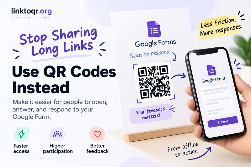
The Real Problem Isn't Your Google Form
When people don't complete a form, it's tempting to blame the questions.
Maybe the form is too long. Maybe the questions aren't clear. Maybe the offer isn't attractive enough. Those things can certainly matter, but there's another issue that often gets overlooked: access friction.
Imagine someone standing in front of a poster at an event. The poster says, “Please complete our survey,” followed by a URL. They have to take out their phone, open a browser, carefully type the address, check whether they made a typo, wait for the page to load, and then finally start answering.
It doesn't sound difficult. It is just annoying enough.
And when an action is optional, even a tiny amount of friction can be the difference between “Sure, I'll do it” and “Maybe later.”
A QR code changes that first part of the journey. Instead of asking someone to reproduce a web address manually, you give them a visual shortcut from the physical world to the digital one.
Think About the Journey, Not Just the Form
A useful way to look at this is to forget about the form for a moment.
Your real journey isn't:
Google Form → Submit
It's:
Person notices something → decides to participate → opens the form → understands the questions → completes it → submits
The QR code lives right in the middle of that journey.
That makes it especially useful in situations where people encounter your form away from a computer or a clickable link. A customer might see a feedback request at the checkout counter. A student might see a survey at the end of a presentation. An event attendee might need to register for a giveaway. A restaurant might want guests to leave feedback before they walk out the door.
In all of those cases, the question isn't “How do I make a fancy QR code?”
The better question is:
How do I make the next step ridiculously obvious?
When a QR Code Makes More Sense Than a Link
Not every Google Form needs a QR code. If you're sending the form through email, for example, a clickable button is usually the natural choice. Asking someone to scan their computer screen with their phone just to open a link would be adding friction rather than removing it.
Offline is where the QR code really earns its keep.
Think about a printed registration sheet sitting on a counter. Instead of printing a long URL underneath the instructions, you can give visitors a quick scan option. The same idea works on event posters, menus, classroom materials, product packaging, reception desks, flyers, table tents, and presentation slides.
The important detail is context. A QR code works best when the person looking at it already has a reason to take the next step.
That's why “Scan to register” is much more useful than simply placing a mysterious black-and-white square in the corner of a poster.
Don't Make People Guess What They're Scanning For
Here's a small detail that can make a surprisingly big difference: tell people what happens after the scan.
“Scan QR” is technically an instruction, but it doesn't tell the user why they should care.
Compare it with:
Scan to register for the event
Scan to leave your feedback
Scan to join the giveaway
Scan to complete the survey
The second approach gives the QR code a purpose.
This matters because people don't scan QR codes just because they're there. They scan when the expected result is clear enough to justify the action.
Think of the QR code as a doorway. The sign beside the doorway should tell people where they're going.
Five Places Where a Google Form QR Code Can Be Useful
Events and Check-In
Events are a classic example. Instead of creating a separate manual process for every registration or feedback request, a QR code can sit where attendees are already waiting or checking in.
It could lead to an attendance form, feedback survey, contest entry, contact form, or post-event questionnaire.
The trick is timing. Give people the QR code when they naturally have a few seconds to use it.
Retail Stores
A physical store can use QR codes to connect an in-person experience with an online form.
A small sign near the checkout might say “Tell us how we did.” A product display could invite customers to complete a quick survey. A service counter could offer a feedback form after an interaction.
The physical location creates the context; the QR code provides the bridge.
Classrooms and Workshops
Teachers, trainers, and workshop organizers often need quick responses from a room full of people. Passing around a link verbally is not exactly a recipe for smooth execution.
A QR code on the presentation screen gives everyone the same destination without asking them to type anything.
It can be used for a quick poll, registration, feedback, quiz, or post-session survey.
Printed Materials
Flyers and brochures have one obvious limitation: they can't contain clickable buttons.
A QR code solves that problem elegantly. Instead of asking readers to remember or manually enter a URL later, you can give them an immediate way to continue from paper to phone.
Reception and Service Areas
Waiting areas are another interesting opportunity. If customers already have their phones out, a small sign can invite them to provide feedback, update information, complete registration, or request something without requiring staff to handle every step manually.
The key isn't putting QR codes everywhere. It's putting them where they solve an actual inconvenience.
A QR Code Can't Fix a Bad Form
This part is important.
A smoother entrance doesn't automatically create a better experience once someone gets inside.
If your Google Form contains 25 unnecessary questions, requires information you don't really need, uses confusing wording, or behaves poorly on mobile, making the QR code easier to scan won't magically fix the problem.
In fact, a convenient QR code can sometimes expose a bad form faster because more people reach it.
Before publishing your QR code, look at the entire experience from the user's perspective. Can they understand what the form is for immediately? Are the questions easy to answer on a phone? Are required fields actually necessary? Is the submission process straightforward?
The QR code gets people through the door. Your form has to give them a reason to stay.
Where Should the QR Code Actually Go?
There is no universal “best” placement. The right location depends on when the user is most likely to act.
For an event, that might be at check-in or on a table. For a restaurant, it could be near the point where the customer finishes their meal. For a classroom, the presentation screen might make more sense. For a printed flyer, it could sit directly beside the call-to-action.
One simple rule works surprisingly well:
Put the QR code as close as possible to the moment when the user needs it.
Don't make someone walk across the room after reading “Scan to register.” Don't hide the code in the bottom corner where nobody notices it. And don't make it so tiny that users have to hold their phones two inches away from the paper.
Good placement is part of the user experience.
Make the QR Code for Google Form Part of the Message
The QR code shouldn't feel like decoration. It should be part of the communication.
Imagine a poster that says:
Want to join our giveaway?
Answer three quick questions.
[QR CODE]
Scan to enter
That's much clearer than:
[QR CODE]
Google Form
The first version tells a mini-story: here's what this is, here's what you'll get, and here's what to do next.
That's the difference between simply displaying technology and actually designing an experience around it.
Don't Print Before You Test
This sounds obvious, but printed QR codes have a nasty habit of revealing problems at exactly the worst possible moment.
Before sending a poster, flyer, menu, or sign to the printer, test the complete journey.
Scan it with more than one phone. Open the form while logged out if your audience might not have a Google account. Test the destination on both iPhone and Android devices. Check the QR code at the actual size you'll use in print, not just the enormous version displayed on your monitor.
Then test it from the distance where people are realistically going to scan it.
A QR code that works perfectly at your desk isn't necessarily a QR code that works perfectly on a wall three meters away.
Also check the form itself. The QR code can point to the correct URL while the form has the wrong permissions, an outdated question, or a broken instruction. Always test the entire chain—not just the square pattern.
The Small Change That Removes a Surprisingly Big Obstacle
There's nothing particularly magical about a QR code. Its value comes from something much simpler: reducing the number of things a person has to do before they can take action.
A long URL asks people to type. A clickable link asks people to click. A QR code gives people an option to scan when they're already holding a phone in front of a physical piece of information.
That makes it especially useful for Google Forms that live outside the browser: registrations at events, surveys in stores, feedback after a service, classroom activities, printed campaigns, and countless other offline situations.
The best implementation isn't necessarily the most creative one. It's the one that makes the next step feel obvious.
And when someone can go from “I should probably fill this out” to “I'm already looking at the form” in a couple of seconds, you've removed one more excuse for them to put it off until later.