A link can be perfectly functional and still be annoying to use. You click it, the page loads, and everything works exactly as it should. But take that same URL and put it on a business card, restaurant menu, event poster, product package, or printed flyer, and suddenly things get awkward. Long URLs are difficult to read, unpleasant to type, easy to mistype, and surprisingly bad at making people take action. The problem isn't really the link itself. It's the amount of effort standing between someone and the page you want them to visit.
- A Link Can Work Perfectly and Still Be Difficult to Share
- The Problem Gets Bigger When Your Link Leaves the Screen
- One Scan Can Remove Several Unnecessary Steps
- Where a QR Code Makes the Most Sense
- A QR Code Is Only Useful If the Destination Is Useful
- Before You Print a QR Code, Check These 7 Things
- QR Code or Plain URL? You Don't Always Have to Choose One
- The Real Question Isn't How Long Your URL Is
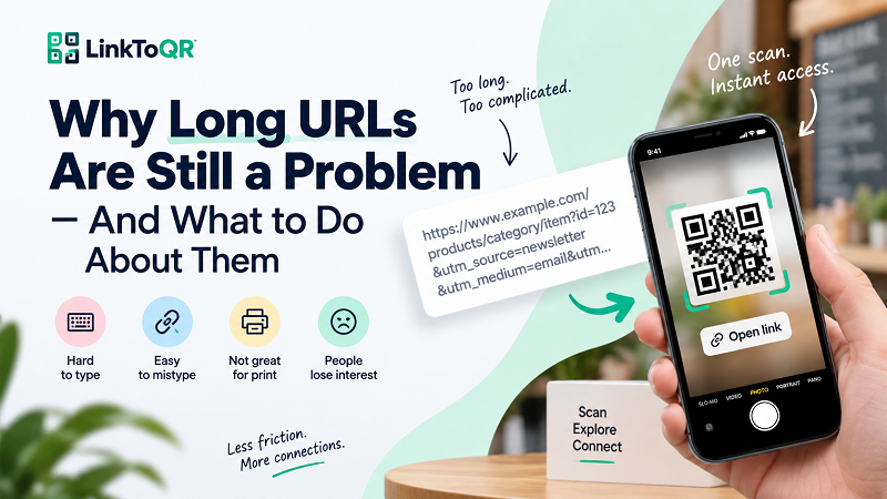
A Link Can Work Perfectly and Still Be Difficult to Share
URLs were designed for computers and browsers, not necessarily for every real-world situation. A short web address can be easy enough to remember or type, but many modern URLs contain paths, parameters, tracking codes, product IDs, campaign tags, and other characters that make them considerably longer. On a screen, that may not matter because users can simply tap the link. Offline, however, the experience changes completely.
Imagine seeing a poster that says, “Visit our website,” followed by a URL stretching across half the page. If you're interested, you have to take out your phone, open a browser, type the address character by character, and hope you didn't accidentally enter an extra letter or miss a symbol. That's a lot of work for something that should take a few seconds. And if the URL contains uppercase and lowercase characters, numbers, slashes, hyphens, or a long string of parameters, the chances of an error only increase.
This becomes even more noticeable when the audience is standing in a store, walking past a poster, sitting at a restaurant, attending an event, or holding a printed document. In those moments, people don't necessarily want to type. They want a fast path from “That looks interesting” to “Show me.”
The Problem Gets Bigger When Your Link Leaves the Screen
Online, a URL can hide behind a button, image, text link, or social media post. Offline, there is nowhere to hide it. The actual address has to be visible, and the longer it becomes, the more visual space it consumes.
Consider a business card. The goal is usually to keep the design clean and make important information easy to find. A long URL can turn into an ugly block of text that competes with the person's name, job title, phone number, and other contact details. A similar problem appears on menus and flyers. The more space the URL takes, the less room you have for the information that actually matters.
Printed marketing materials have another problem: people often see them only briefly. Someone walking past a storefront may have just a few seconds to decide whether something is worth checking out. Asking that person to remember a complicated URL is asking them to do too much. The same applies to conferences, exhibitions, classrooms, waiting rooms, and other physical environments where attention is limited.
The key issue is simple: the harder a destination is to reach, the easier it is for someone to abandon the journey.
One Scan Can Remove Several Unnecessary Steps
This is where QR codes become genuinely useful. Instead of asking someone to manually reproduce a web address, you can turn the URL into something their phone can recognize almost instantly. Point a camera at the code, scan it, and the encoded destination can open in the browser.
A qr code for a link is particularly useful when the original link needs to move from a digital environment into a physical one. You can place it next to a product description, on a restaurant table, inside a printed brochure, or beside an event announcement. The URL doesn't disappear; the QR code simply provides a more convenient way to reach it.
The important distinction is that a QR code isn't really replacing the destination. It is removing unnecessary friction on the way there. The website, landing page, online menu, registration form, product page, or other destination remains the same. What changes is how easily people can access it.
Where a QR Code Makes the Most Sense
The best use cases usually have one thing in common: the person is physically looking at something while the destination lives online.
Think about a poster advertising an upcoming event. A visitor may want to see the schedule or register, but typing a long URL into their phone creates an unnecessary interruption. A QR code turns the poster itself into an entry point.
The same principle works with business cards. Instead of filling valuable space with a complicated web address, a card can include a QR code alongside the person's name and contact information. Someone receiving the card can scan it immediately or save the card and scan it later.
Restaurants have another obvious use case. A printed menu can contain a QR code leading to an online menu, ordering page, reservation page, special offer, or allergen information. The customer doesn't need to remember anything; the physical menu becomes the bridge to the digital experience.
Packaging can work in a similar way. A product box might contain a QR code leading to setup instructions, a product video, warranty information, recipes, or additional product details. Here, the QR code isn't just a shortcut to a website. It connects a physical product to information that would be impractical to print on the package itself.
A QR Code Is Only Useful If the Destination Is Useful
There's an easy mistake to make when working with QR codes: focusing so much on the code that the destination becomes an afterthought.
A perfectly scannable QR code leading to a slow, confusing, or irrelevant page is still a poor experience. The scan is only the beginning. What happens immediately afterward matters just as much.
If a poster says “Scan for today's special offers,” the QR code should take people somewhere that actually shows those offers. If a product package promises setup instructions, the destination should make those instructions easy to find. If a business card invites someone to learn more about a professional, the linked page should clearly identify that person and provide the information the visitor expected.
Mobile usability is especially important. Someone scanning a QR code is almost certainly using a phone, so the destination should be easy to navigate on a small screen. Large buttons, readable text, fast loading, and a clear next step can make the difference between a useful scan and an immediate exit.
In other words, don't optimize only for the scan. Optimize for what happens after it.
Before You Print a QR Code, Check These 7 Things
A QR code may look fine on your computer and still perform poorly once it becomes a physical object. Before sending a design to the printer, test the actual version that people will see.
First, scan it yourself. This sounds obvious, but it's the fastest way to catch an incorrect destination. Second, test the final URL on a phone and make sure the page loads correctly. Third, try more than one device rather than assuming one successful scan means everything is fine. Fourth, give the QR code enough physical size for the viewing distance and environment. A code intended for a large poster shouldn't be treated the same way as one printed on a business card. Fifth, maintain strong contrast between the code and its background. Sixth, keep sufficient clear space around the code so nearby design elements don't interfere with scanning. And finally, test the QR code on the actual material and at the actual size whenever possible.
That last step is easy to skip. A QR code that scans perfectly from a monitor may behave differently when printed on textured paper, placed behind reflective packaging, or viewed from several feet away.
QR Code or Plain URL? You Don't Always Have to Choose One
QR codes aren't a universal replacement for URLs. In many digital environments, a normal clickable link is still the simplest option. If someone is already reading an email on their phone, for example, asking them to scan a QR code with the same phone would be unnecessary.
The real advantage appears when the link and the person are in different environments. A printed brochure can't have a clickable button. A storefront sign can't automatically open a browser. A conference badge can't tap a link the way a smartphone screen can. In these situations, a QR code creates a bridge between the physical object and the digital destination.
There are also situations where keeping both options makes sense. A printed document can show a short, readable URL for people who prefer typing while offering a QR code for everyone who wants the faster route. The goal isn't to follow a QR trend just because QR codes are popular. The goal is to make the next action easier.
The Real Question Isn't How Long Your URL Is
A long URL isn't automatically a bad URL. If it works, accurately represents the destination, and is easy to use in its environment, there may be no problem at all. The trouble begins when a link designed for a browser gets pushed into a situation where people have to manually interact with it.
That's why the better question isn't, “Is my URL too long?” It's “How much effort am I asking someone to make before they reach the information I promised?”
For online experiences, a normal clickable link may be all you need. For physical materials, a QR code can remove several unnecessary steps and turn a printed message into an immediate digital doorway. When the destination is relevant, the design is tested, and the experience after the scan is useful, that tiny square can do something surprisingly valuable: make the journey from seeing to visiting feel almost effortless.