Getting a QR code to scan feels like the finish line. It isn't.
- Start With the Destination, Not the QR Design
- Open the Link on the Device Your Audience Will Actually Use
- Check What Happens During the First Five Seconds
- Remove Unnecessary Friction
- Make the QR Promise Match the Destination
- Test the Printed Version, Not Just the Digital Preview
- Think About the QR's Entire Lifespan
- A Simple Pre-Launch QR Check
- When You're Ready to Make Link Into QR Code
- The QR Is Only the Door
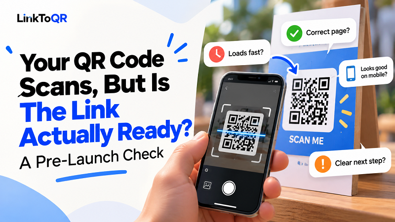
A phone recognizes the pattern, the camera opens the link, and everything appears to work. Great — but what happens next? If the destination loads slowly, looks terrible on a phone, asks visitors to log in, leads to the wrong page, or simply doesn't deliver what the QR code promised, the scan was technically successful but practically useless.
That distinction matters. A QR code isn't the experience. It's the doorway to the experience.
Before putting one on a poster, product package, business card, menu, flyer, receipt, or anything else you plan to print in quantity, take a few minutes to test what happens after the scan. A small check now can save you from a surprisingly expensive reprint later.
Start With the Destination, Not the QR Design
It's easy to get distracted by the appearance of a QR code. You might spend time choosing its size, placement, or surrounding design while overlooking the thing people actually reach after scanning.
Start with the URL.
Open it yourself and ask a simple question: If I were seeing this for the first time, would I immediately understand why I landed here?
Check that the address is correct and that it leads to the intended page rather than a generic homepage. If the QR appears beside a message such as "Watch the tutorial," the destination should contain that tutorial. If the CTA says "Get the menu," visitors shouldn't have to hunt through five pages to find it.
The closer the destination matches the promise printed next to the QR code, the less thinking the user has to do.
Open the Link on the Device Your Audience Will Actually Use
A desktop browser can make almost any website look better than it really is.
QR codes, however, are overwhelmingly associated with phones. So don't stop after checking the destination on your computer. Grab a phone and experience the page as a real visitor would.
Look at the basics first. Does the page load? Is the text readable without zooming? Are buttons easy to tap? Does anything overlap? Are images cropped strangely? Is a critical piece of information buried below a huge banner?
Then go one step further. Try the page using mobile data rather than only a fast Wi-Fi connection. A visitor standing outside a store, at an event, or next to a poster may not have the same connection you do.
A destination that works beautifully in your office but struggles on a phone is not ready just because the QR code itself scans.
Check What Happens During the First Five Seconds
Here's a useful test: scan the QR and don't give yourself extra context. Pretend you are a stranger who has never seen the page before.
Within a few seconds, you should be able to answer three questions:
Where am I?
Why am I here?
What should I do next?
If the answer to any of those questions is unclear, the destination needs work.
This is particularly important when a QR code appears in a physical environment. The person scanning it has already interrupted whatever they were doing to pull out their phone. Don't make them work even harder to figure out what comes next.
A strong QR journey feels almost effortless: scan, recognize, act.
Remove Unnecessary Friction
Every extra step gives someone another reason to leave.
Maybe the page immediately displays a newsletter popup. Maybe it asks visitors to create an account before showing basic information. Maybe the useful button is hidden beneath a wall of copy. Maybe the destination requires an app when a mobile web page would have done the job.
Not every extra step is avoidable, but unnecessary friction is.
Think about the single action you want the visitor to take and make that action obvious. If the QR exists to collect feedback, the feedback form should be easy to find. If it exists to show a video, the video should be immediately visible. If it leads to a promotion, the offer shouldn't be buried under unrelated content.
The QR code gets the person through the door. Don't put a maze behind it.
Make the QR Promise Match the Destination
One of the easiest mistakes to make is creating a mismatch between the printed CTA and the actual destination.
Imagine a restaurant poster saying:
Scan to see today's specials
The QR opens the restaurant's Facebook homepage.
Technically, nothing is broken. The code works. The page works. But the experience doesn't match the promise.
Now imagine a product package saying:
Scan to watch the setup guide
but the QR opens a YouTube channel containing dozens of unrelated videos. The customer has been given a search task they never asked for.
Your CTA and destination should tell the same story.
If you promise one specific thing, make that thing easy to reach. The fewer decisions visitors have to make after scanning, the stronger the experience becomes.
Test the Printed Version, Not Just the Digital Preview
A QR code can look perfect on your screen and behave differently once it's printed.
This is where many projects get caught off guard.
The final printed version may be smaller than expected. The background may reduce contrast. Nearby graphics or text may crowd the code. Printing quality can affect the sharpness of the modules. A design that looked fine in a digital mockup may become frustrating when someone tries to scan it from several feet away.
So if you're preparing a physical campaign, print a sample.
Don't necessarily test it from your desk at arm's length. Test it from approximately the distance a real person would use it. Put the sample where the final material will appear and scan it under realistic lighting.
This is especially important for large posters, packaging, displays, signage, and other materials where people won't necessarily be standing directly in front of the code.
Think About the QR's Entire Lifespan
There's another question worth asking before you print hundreds or thousands of copies:
Will this destination still make sense later?
A temporary campaign page might be perfect today and completely irrelevant three months from now. A product video might be replaced. A promotion might expire. A social post might be deleted or become outdated.
The QR can continue to scan perfectly while the experience behind it quietly falls apart.
This is why destination choice should happen before mass printing, not after. Consider how long the physical material will remain in circulation and whether the URL is appropriate for that entire period.
A QR printed on a disposable flyer has a different lifespan from one printed permanently on product packaging.
A Simple Pre-Launch QR Check
Before publishing a QR code, run through this quick test:
- Correct URL: Does the QR open the exact destination you intended?
- Mobile experience: Does the page work properly on a phone?
- Clear purpose: Can a new visitor understand the page immediately?
- Strong CTA: Is the next action obvious?
- Expectation match: Does the destination deliver what the printed message promises?
- Low friction: Are unnecessary steps removed?
- Real-world scan: Does the physical version scan from the expected distance?
- Visibility: Is the QR easy to notice and distinguish from its background?
- Longevity: Will the destination remain useful for as long as the QR is in circulation?
- Final test: Has someone other than the creator tried the complete journey?
That last point is surprisingly valuable. The person who created the QR already knows where it is supposed to go. A fresh tester doesn't have that advantage, which makes their experience much closer to a real user's.
When You're Ready to Make Link Into QR Code
Once the destination passes these checks, creating the QR itself becomes the easy part. You can make link into qr code and move on to the more important question: how and where people will encounter it.
Keep the workflow in that order.
First, decide what the user needs to reach. Then make sure the destination delivers it cleanly. Then create the QR. Finally, test the complete journey in the environment where people will actually use it.
That sequence prevents a common mistake: treating QR generation as the entire project.
The QR Is Only the Door
A successful scan is a technical event. A successful QR campaign is a user experience.
That's why the best time to test a QR code isn't after thousands of copies have been printed. It's before the first one goes live.
Scan it. Open the destination. Forget everything you know about the project for a moment and experience it like a stranger. If the path from scan to action feels obvious, you're in good shape.
If it doesn't, fix the destination before you blame the QR.
Because when a QR code fails, the problem isn't always the little square pattern. Sometimes, the real problem is what you put behind it.